Migration from V1 to V2
Major Changes
ChakraUIRemoved
In CosmosKit V2, we discard the dependency on ChakraUI due to numerous runtime errors and the cost of CSS-in-JS.
Main changes lie in @cosmos-kit/react, where the default modal locates. All the modal components are imported from @interchain-ui/react, which is our UI Kit in Cosmology. The latest @interchain-ui/react discards ChakraUI and instead adopts a pure CSS styling solution through a package called vanilla-extract.
- Build Process Changed
In CosmosKit V2, we used pure tsc to compile CommonJS, ESM (es2022) instead of babel. Also, .js and .d.ts files are no longer to be separated in different folders, in this way non-index sources can easily find its corresponding types.
Migration Guides
-
In CosmosKit V2, we require developers to install
@interchain-ui/reactand requireimport "@interchain-ui/react/styles"in your top-level route/layout if you are using our default modal in@cosmos-kit/react. i.e. in_app.tsx(opens in a new tab) for next project. -
We don't export
defaultThemeanymore in@cosmos-kit/reactin CosmosKit V2. -
WrappedWithChakraandmodalThemeis removed in properties ofChainProviderfrom@cosmos-kit/react. -
Web3Authwallet instance import has been replaced by constructing the wallet instance with a wallet generator function. In this way the web3auth implementation becomes much more secure, and also makes it support any of the login providers. See details here
Customizing the default modal
Customizing the default modal styles is done through modalTheme prop of <ChainProvider />
We are currently providing 2 ways to customize the default modal:
- Overriding the theme object:
By using the modalTheme.themeDefs and modalTheme.customTheme, you can override all of the theme tokens however you want
<ThemeProvider
  themeDefs={[
    {
      {/* Provide a unique name for your custom theme */}
      name: ``,
      vars: {
        colors: {
          {/* Override your branding colors */}
          primary500: ``,
        },
        space: {
          {/* Or spacing tokens */}
        }
      },
    },
  ]}
  {/* Custom theme name, this corresponds to one of the theme provided in themeDefs prop */}
  customTheme="custom"
>
  {children}
</ThemeProvider>
The full object shape of themeDefs[index].vars is as below
{
  colors: {
    primary: ``,
    body: ``,
    background: ``,
    link: ``,
    linkHover: ``,
    text: ``,
    textSecondary: ``,
    textDanger: ``,
    textWarning: ``,
    textPlaceholder: ``,
    rewardBg: ``,
    rewardContent: ``,
    cardBg: ``,
    inputBorder: ``,
    inputBg: ``,
    inputDangerBorder: ``,
    inputDangerBg: ``,
    inputDisabledBg: ``,
    inputDisabledText: ``,
    progressBg: ``,
    progressValue: ``,
    progressCursor: ``,
    divider: ``,
    menuItemBg: ``,
    menuItemBgHovered: ``,
    menuItemBgActive: ``,
    skeletonBg: ``,
    black: ``,
    blackPrimary: ``,
    white: ``,
    transparent: ``,
    current: ``,
    whiteAlpha50: ``,
    whiteAlpha100: ``,
    whiteAlpha200: ``,
    whiteAlpha300: ``,
    whiteAlpha400: ``,
    whiteAlpha500: ``,
    whiteAlpha600: ``,
    whiteAlpha700: ``,
    whiteAlpha800: ``,
    whiteAlpha900: ``,
    blackAlpha50: ``,
    blackAlpha100: ``,
    blackAlpha200: ``,
    blackAlpha300: ``,
    blackAlpha400: ``,
    blackAlpha500: ``,
    blackAlpha600: ``,
    blackAlpha700: ``,
    blackAlpha800: ``,
    blackAlpha900: ``,
    gray50: ``,
    gray100: ``,
    gray200: ``,
    gray300: ``,
    gray400: ``,
    gray500: ``,
    gray600: ``,
    gray700: ``,
    gray800: ``,
    gray900: ``,
    red50: ``,
    red100: ``,
    red200: ``,
    red300: ``,
    red400: ``,
    red500: ``,
    red600: ``,
    red700: ``,
    red800: ``,
    red900: ``,
    orange50: ``,
    orange100: ``,
    orange200: ``,
    orange300: ``,
    orange400: ``,
    orange500: ``,
    orange600: ``,
    orange700: ``,
    orange800: ``,
    orange900: ``,
    yellow50: ``,
    yellow100: ``,
    yellow200: ``,
    yellow300: ``,
    yellow400: ``,
    yellow500: ``,
    yellow600: ``,
    yellow700: ``,
    yellow800: ``,
    yellow900: ``,
    green50: ``,
    green100: ``,
    green200: ``,
    green300: ``,
    green400: ``,
    green500: ``,
    green600: ``,
    green700: ``,
    green800: ``,
    green900: ``,
    blue50: ``,
    blue100: ``,
    blue200: ``,
    blue300: ``,
    blue400: ``,
    blue500: ``,
    blue600: ``,
    blue700: ``,
    blue800: ``,
    blue900: ``,
    primary50: ``,
    primary100: ``,
    primary200: ``,
    primary300: ``,
    primary400: ``,
    primary500: ``,
    primary600: ``,
    primary700: ``,
    primary800: ``,
    primary900: ``,
    purple50: ``,
    purple100: ``,
    purple200: ``,
    purple300: ``,
    purple400: ``,
    purple500: ``,
    purple600: ``,
    purple700: ``,
    purple800: ``,
    purple900: ``,
  },
  font: {
    body: ``,
  },
  space: {
    "0": ``,
    "1": ``,
    "2": ``,
    "3": ``,
    "4": ``,
    "5": ``,
    "6": ``,
    "7": ``,
    "8": ``,
    "9": ``,
    "10": ``,
    "11": ``,
    "12": ``,
    "13": ``,
    "14": ``,
    "15": ``,
    "16": ``,
    "17": ``,
    "18": ``,
    "19": ``,
    "20": ``,
    "21": ``,
    "22": ``,
    "23": ``,
    "24": ``,
    "25": ``,
    "26": ``,
    "27": ``,
    "28": ``,
    "29": ``,
    "30": ``,
    auto: ``,
    full: ``,
    fit: ``,
    max: ``,
    min: ``,
    viewHeight: ``,
    viewWidth: ``,
    none: ``,
  },
  borderWidth: {
    none: ``,
    sm: ``,
    base: ``,
    md: ``,
    lg: ``,
    xl: ``,
  },
  borderStyle: {
    none: ``,
    solid: ``,
    dotted: ``,
    dashed: ``,
    groove: ``,
    ridge: ``,
    hidden: ``,
    double: ``,
    inset: ``,
    outset: ``,
    unset: ``,
  },
  boxShadow: {
    xs: ``,
    sm: ``,
    base: ``,
    md: ``,
    lg: ``,
    xl: ``,
    "2xl": ``,
    inset: ``,
    primaryOutline: ``,
    none: ``,
    "dark-lg": ``,
  },
  radii: {
    none: ``,
    sm: ``,
    base: ``,
    md: ``,
    lg: ``,
    xl: ``,
    "2xl": ``,
    "3xl": ``,
    "4xl": ``,
    full: ``,
  },
  letterSpacing: {
    tighter: ``,
    tight: ``,
    normal: ``,
    wide: ``,
    wider: ``,
    widest: ``,
  },
  lineHeight: {
    normal: ``,
    none: ``,
    shorter: ``,
    short: ``,
    base: ``,
    tall: ``,
    taller: ``,
  },
  fontWeight: {
    hairline: ``,
    thin: ``,
    light: ``,
    normal: ``,
    medium: ``,
    semibold: ``,
    bold: ``,
    extrabold: ``,
    black: ``,
  },
  fontSize: {
    "3xs": ``,
    "2xs": ``,
    xs: ``,
    sm: ``,
    md: ``,
    lg: ``,
    xl: ``,
    "2xl": ``,
    "3xl": ``,
    "4xl": ``,
    "5xl": ``,
    "6xl": ``,
    "7xl": ``,
    "8xl": ``,
    "9xl": ``,
    "10xl": ``,
    "11xl": ``,
    "12xl": ``,
    "13xl": ``,
    "14xl": ``,
    "15xl": ``,
  },
  zIndex: {
    "0": ``,
    "10": ``,
    "20": ``,
    "30": ``,
    "40": ``,
    "50": ``,
    "100": ``,
    auto: ``,
  },
}- Overriding css vars specific to a component.
This is done through the modalTheme.overrides prop, which is a record with keys corresponding to a slot names and values are objects of overridable property name and its value in each theme mode.
{
  <slot_name>: {
    <property>: { light: <value>, dark: <value> }
  }
}
Example:
<ThemeProvider
  overrides={{
    // Slot named 'button'
    button: {
      // map overridable props to their values for each theme mode
      bg: {
        light: "red",
        dark: "blue",
      },
    },
  }}
>
  {children}
</ThemeProvider>
Supported overridable slots/components and their overridable state/attributes are:
{
  "button": [
    "bg",
    "hoverBg",
    "color",
    "hoverColor"
  ],
  "clipboard-copy-text": [
    "color",
    "borderColor"
  ],
  "connect-modal": [
    "bg",
    "shadow"
  ],
  "connect-modal-install-button": [
    "bg",
    "borderColor",
    "color",
    "shadow"
  ],
  "connect-modal-head-title": [
    "color"
  ],
  "connect-modal-wallet-button": [
    "color",
    "bg",
    "focusedBg",
    "hoverBg",
    "focusedShadow",
    "hoverShadow",
  ],
  "connect-modal-wallet-button-label": [
    "color"
  ],
  "connect-modal-wallet-button-sublogo": [
    "bg",
    "borderColor"
  ],
  "connect-modal-qr-code": [
    "bg",
    "color",
    "borderColor",
    "shadow"
  ],
  "connect-modal-qr-code-shadow": [
    "bg"
  ],
  "connect-modal-qr-code-error": [
    "bg"
  ],
  "connect-modal-qr-code-error-button": [
    "bg",
    "color",
    "shadow"
  ],
  "connect-modal-qr-code-loading": [
    "bg"
  ]
}
Additionally, you can customize the base modal class names using the follow properties of <ChainProvider />'s modalTheme prop:
type ModalCustomizationProps = {
  modalContainerClassName?: string;
  modalContentClassName?: string;
  modalChildrenClassName?: string;
  modalContentStyles?: React.CSSProperties;
};
Improvement in bundle size in v2
Since we dropped Chakra UI to build our own foundational UI system. The bundle size dropped a lot. Here are some screenshots and bundle size improvement
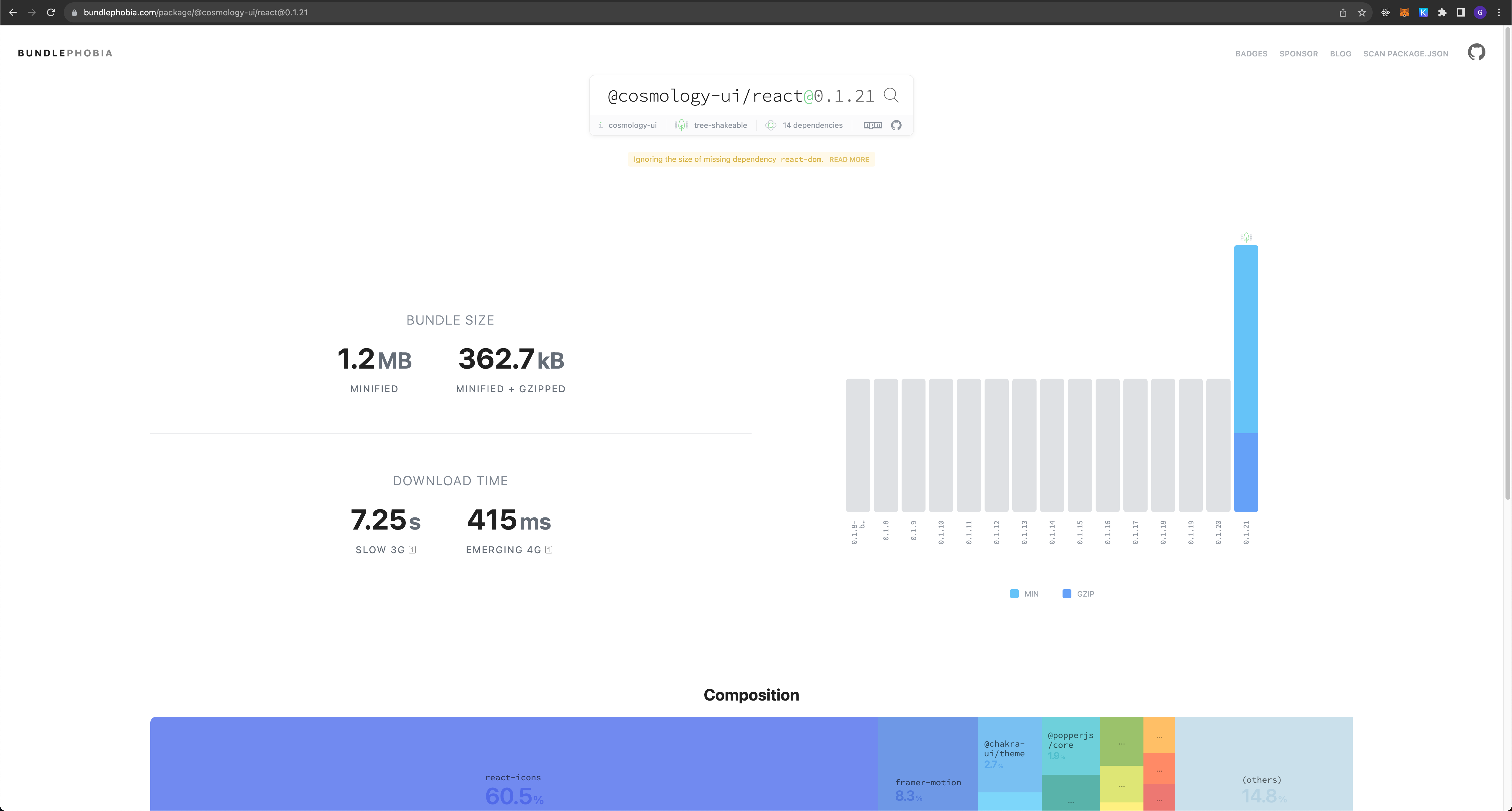
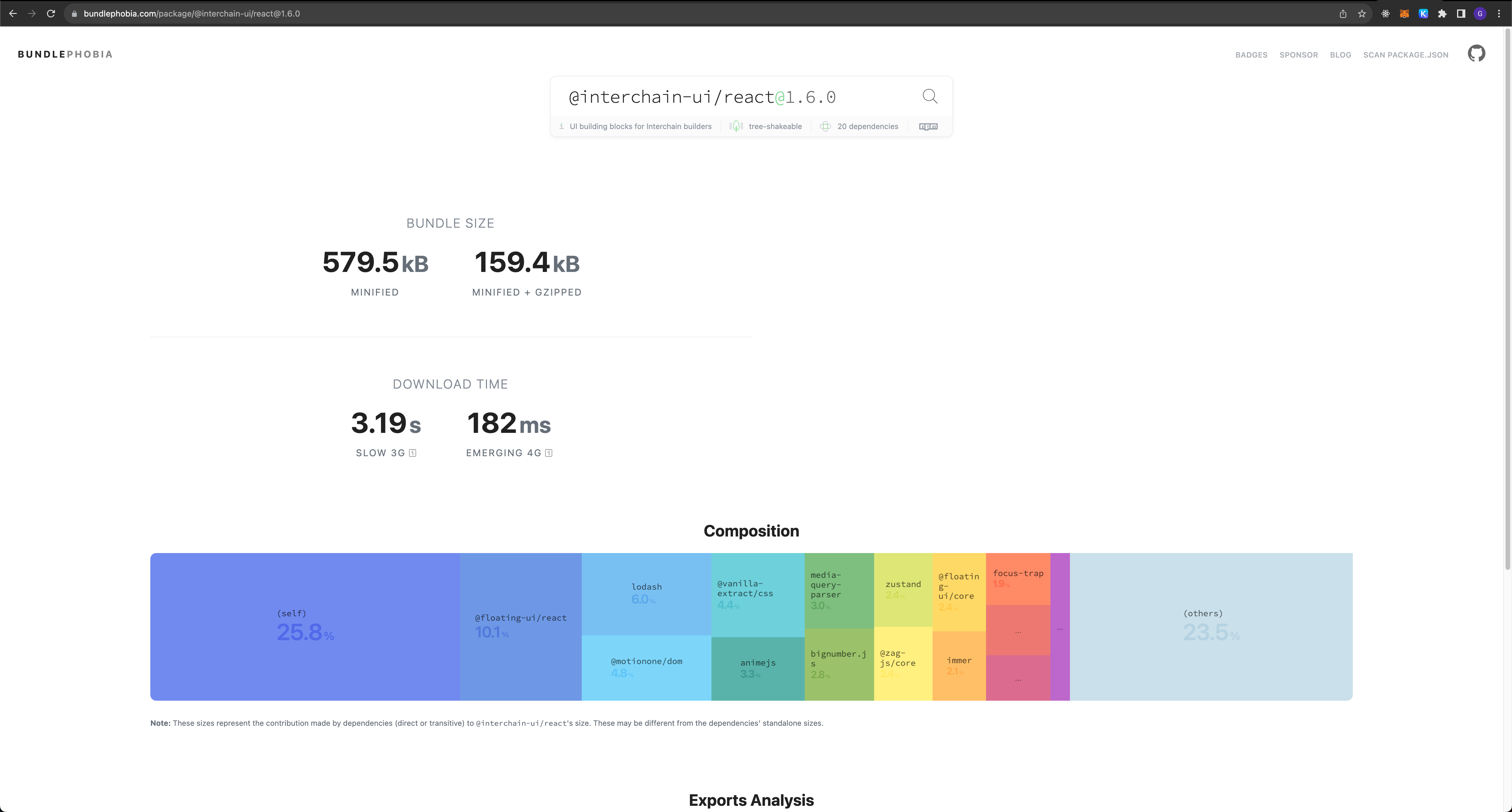
Core UI size improvement
In the new package @interchain-ui/react, package size dropped from 362kb to 159kb (minified + gzipped)
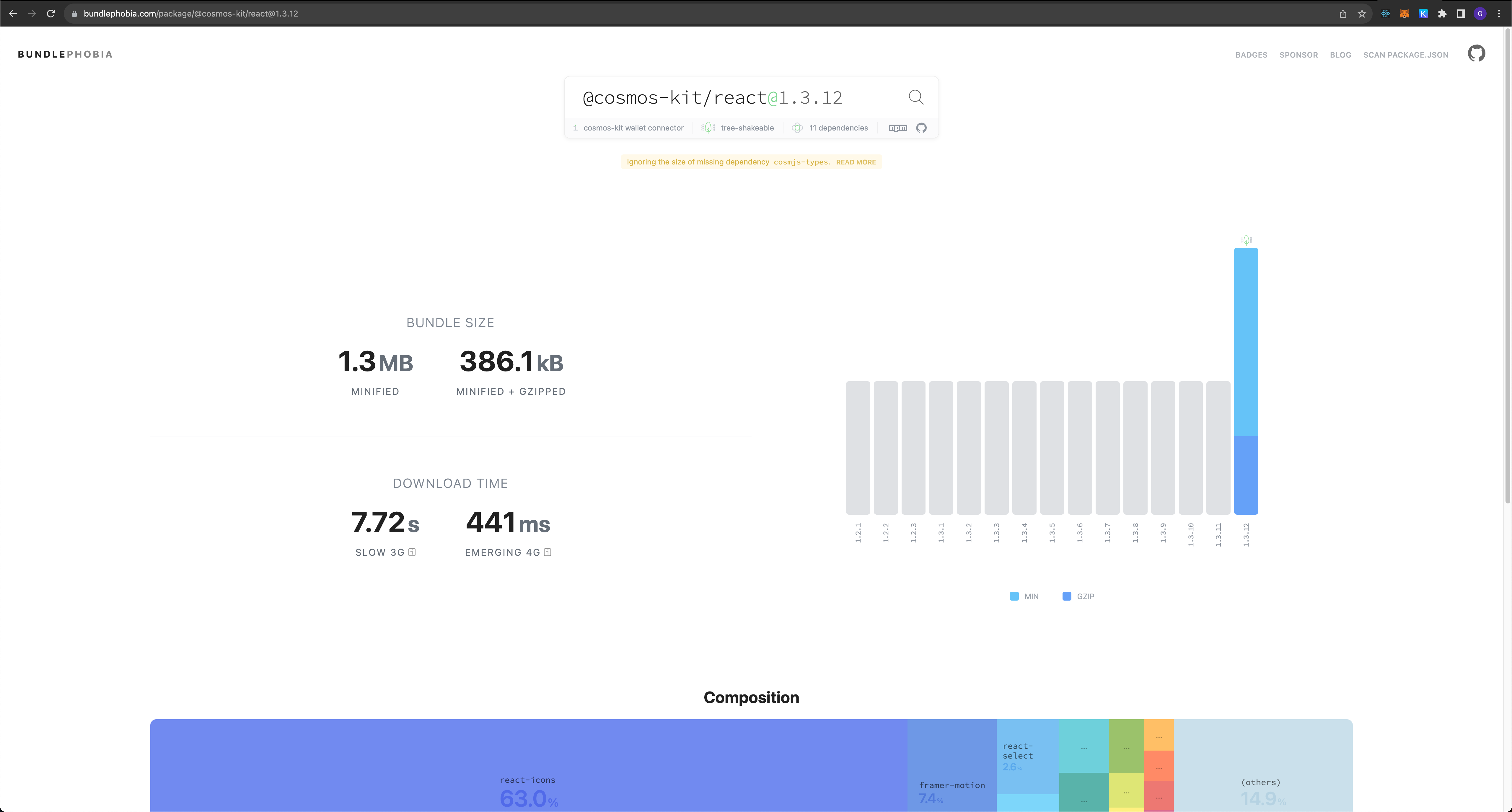
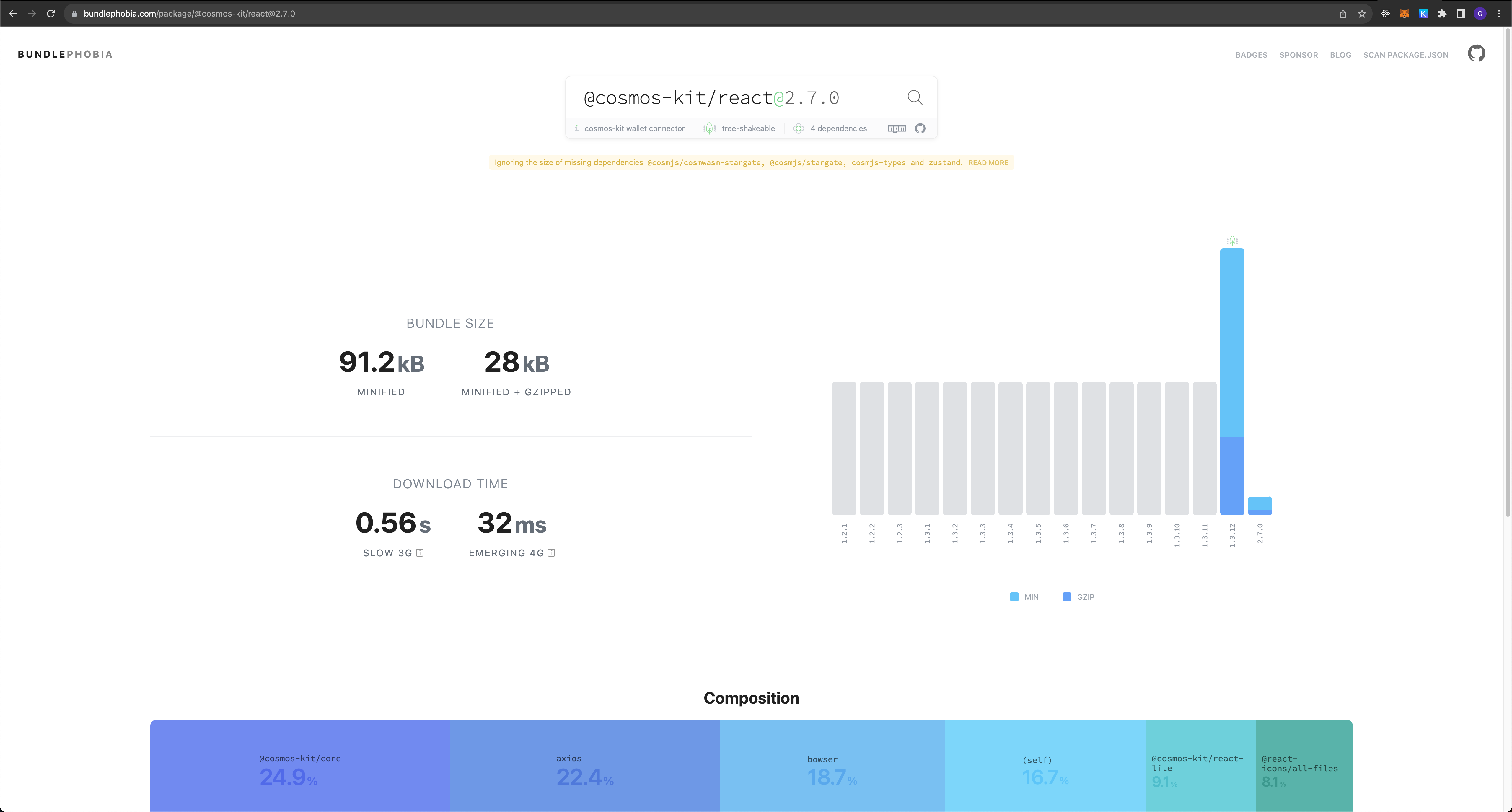
Cosmos Kit size improvement
Additionally, we also reduce the bundle size of cosmos kit by significant amount, from 386kb to just 28kb (minified + gzipped)
We're pretty happy with the improvement in V2 so far and looking to improve it much more.